project story
End-to-End Design for New USAID Website
The project would need solution and client leadership, and I stepped up.
The project budget, staffing and timeline constraints required someone to play the role of solution lead. Having worked on several USAID engagements, I agreed to serve as the solution and client lead, in addition to acting as the UX Designer on the project. Over the course of a year, I led a product team of about five dedicated people (content strategist, front/back end dev, UI designer) and five short term roles (including QA specialists, analytics specialists, writers, accessibility). I also coordinated the web work with two other contractors who brought subject matter expertise.
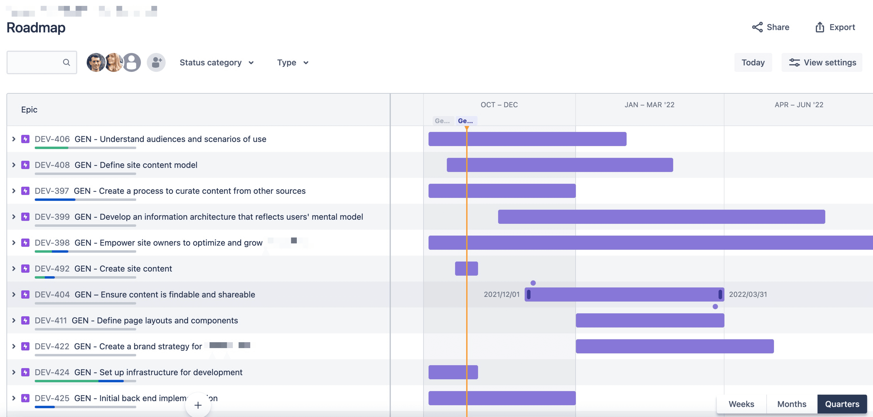
I defined the team's approach to discovery, information architecture, design, and technical implementation, and captured these in a product roadmap.
The opportunity is to improve knowledge-sharing among USAID Gender Advisors and partners.
USAID’s gender content is spread across numerous digital touchpoints, limiting its effectiveness for the USAID mission staff and partners who need it. In the words of one Gender Advisor:
“I'd really appreciate if there was some website that collects relevant studies, success stories and other up-to-date information about gender equality and women's empowerment. I’m highly supportive of that kind of plan.”
During a three-month discovery before the design work, the team refined our understanding of the business requirements, user needs, and content and technology contexts. To set up the web team for success, I focused on translating the research findings into design priorities and getting the client’s buy-in.
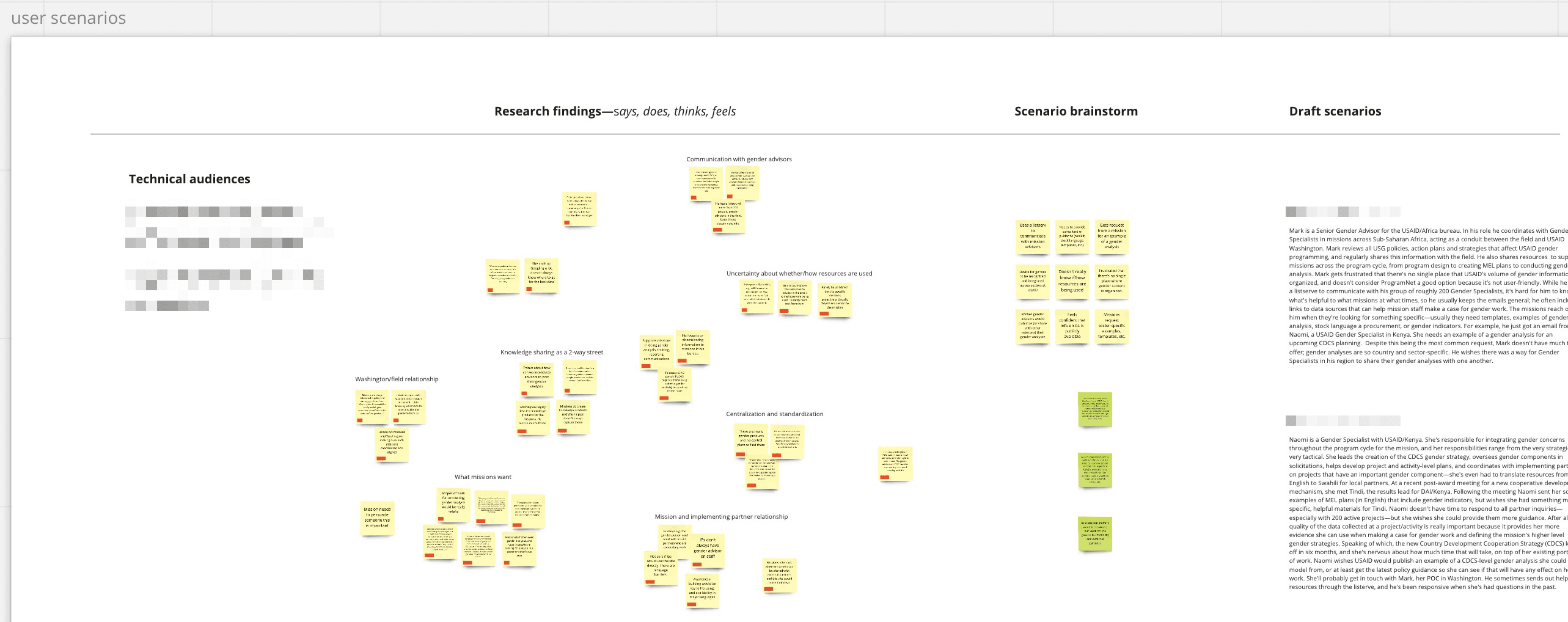
To begin translating research into design priorities, I developed user scenarios. These aimed to identify people’s goals and unmet needs that may be fulfilled through the website. We also used these scenarios to derive tasks for usability testing.
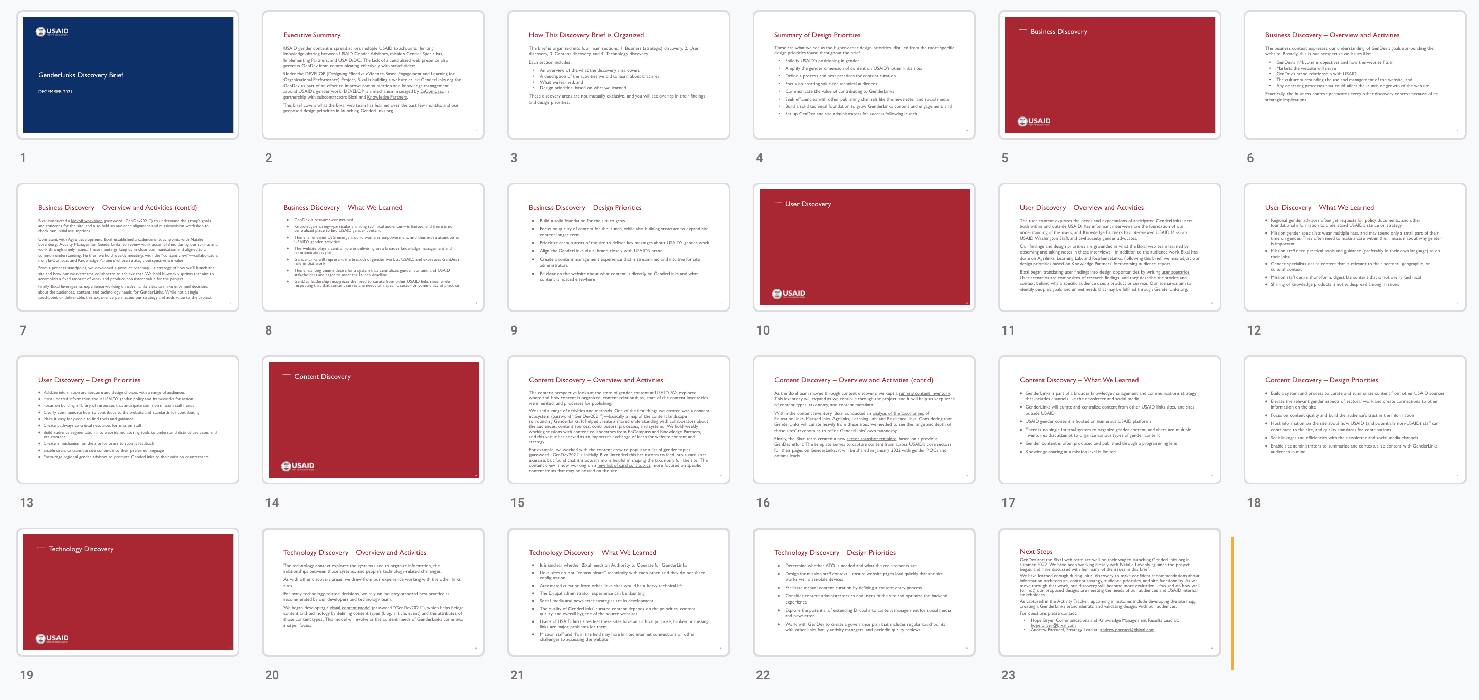
I documented research findings and design priorities in a discovery brief.
I pushed for a content-first design strategy, but the culture ate that for breakfast.
The site would need to accommodate a lot of existing gender content, so I proposed that the team take a content-first approach to the design. We used a variety of methods to work content-first, and we were able to use existing content to define some page layouts and information architecture. But for content that needed to be created, we encountered the age-old problem of the designers wanting content to design around, and the writers wanting the design first. We struggled with this throughout, but made it work by using proto-content and by building flexibility into the Drupal content structure.
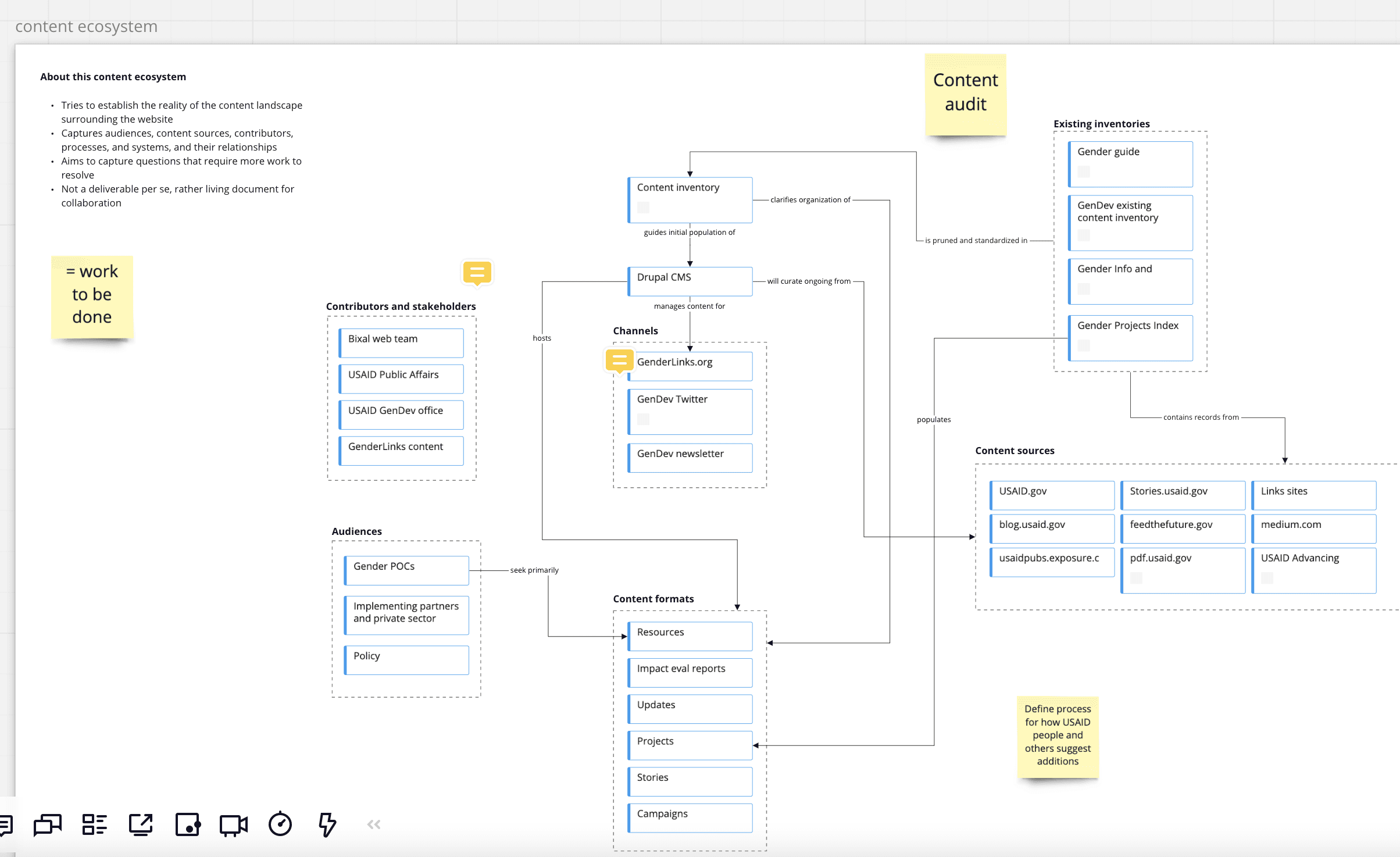
I developed a content ecosystem with the project team to establish a shared understanding of our content landscape. It helped us capture questions that would need to be answered and further work to be done.
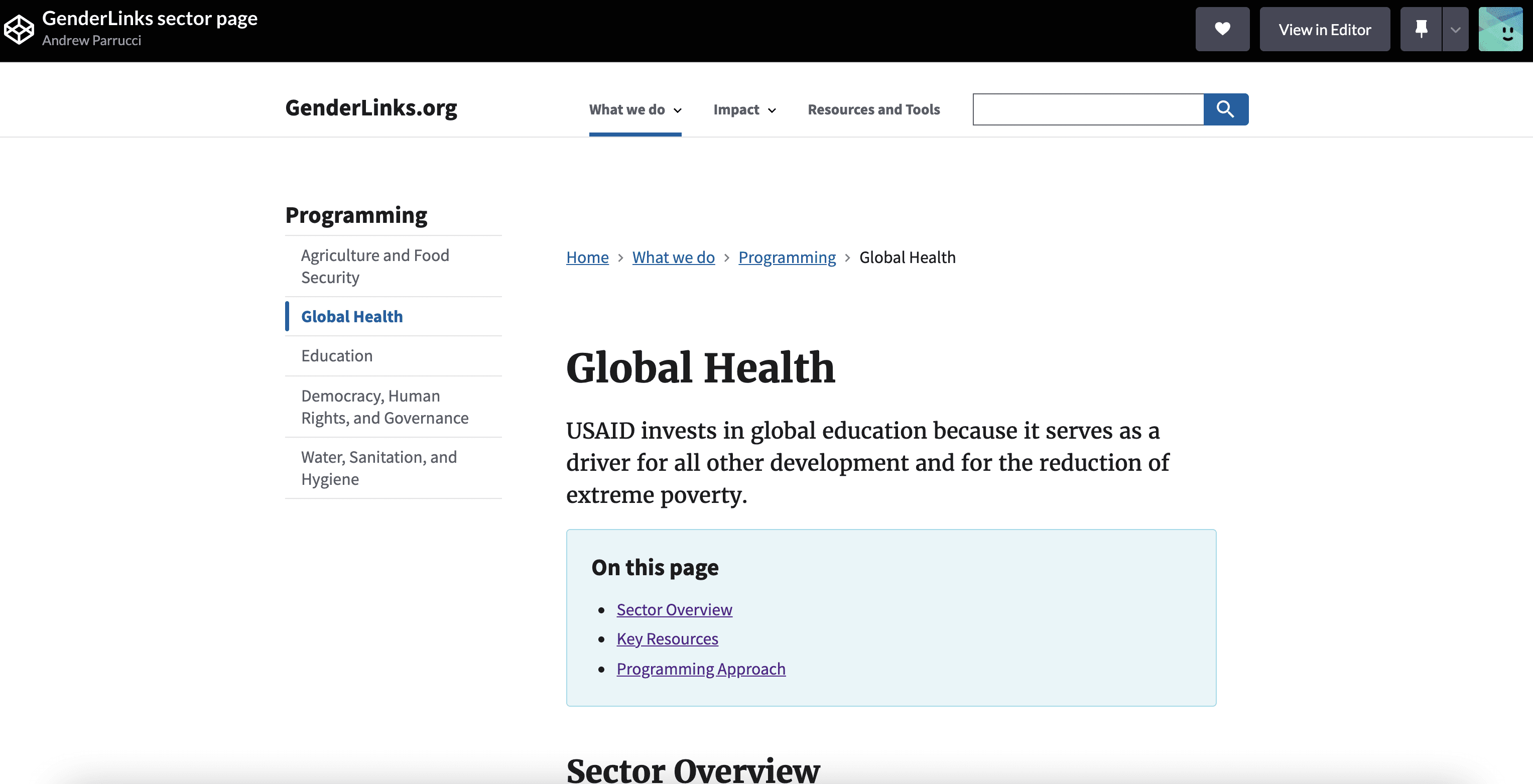
Using U.S. Web Design System components, I created a coded prototype to establish guidelines around word count, page structure, and potential components.
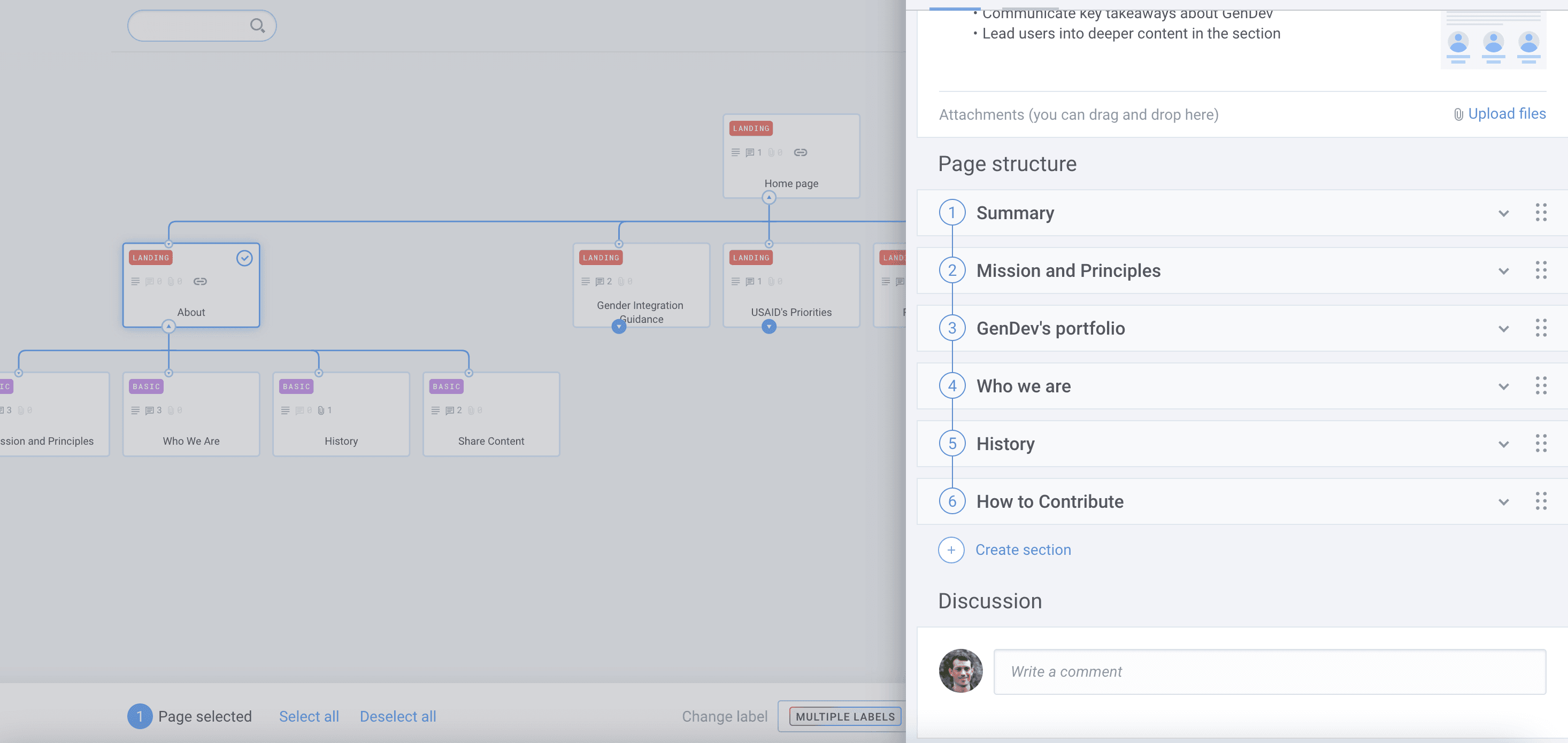
As the card sorts began to reveal content groupings, we refined the site map and proposed page structures.
The client needed a flexible structure that could facilitate near-term content curation, while eventually bridging to original content publishing.
To lay the foundation for long term success, we needed to build some flexibility into the content structure. Working with the content strategist, I conducted card sorting to understand users’ mental models, and created a taxonomy crosswalk to facilitate efficient content curation from other sites. As I worked with the Backend Developer to configure the content model in Drupal, I also worked closely with the UI Designer and Frontend Developer on the components and page layouts.
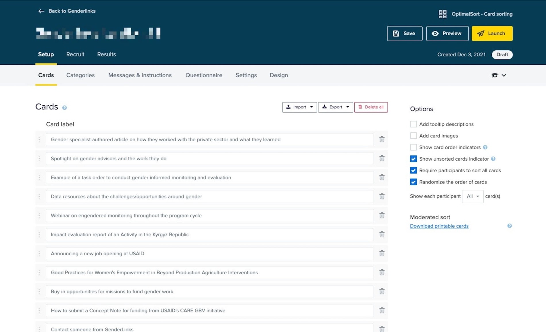
The Content Strategist and I built out a card sort test in Optimal Workshop, developed a discussion guide, and defined the research questions we needed to answer.
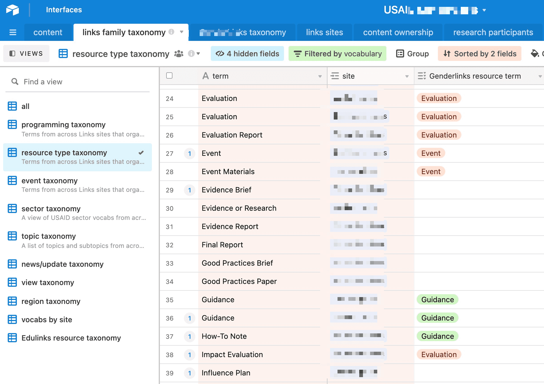
We needed to standardize taxonomies from other sites for our new site, so I started by importing the taxonomies from similar USAID websites. Then I facilitated meetings with SMEs to create a taxonomy crosswalk.
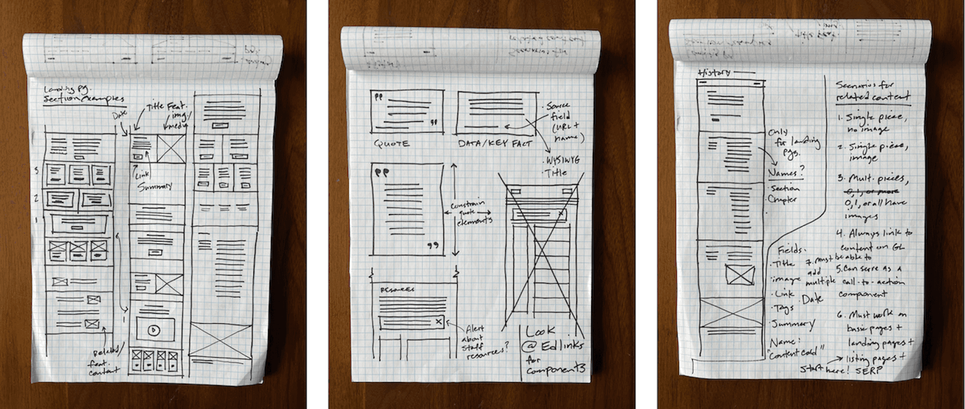
Throughout the design process, I sketched ideas for page layouts and components. This helped me stay creative and generate many ideas quickly.
The team created a design system that was complementary, yet distinctive from the other sites in the family.
As we firmed up the components and page layouts we began bridging into visual design. The visual branding and design were a key approval point for our client and her leadership, so I focused on setting expectations with them and laying out the decisions to be made. The UI Designer and I did a couple of rounds of design treatments, trying to find the right balance of consistency and differentiation with the USAID brand and other sites in the family.
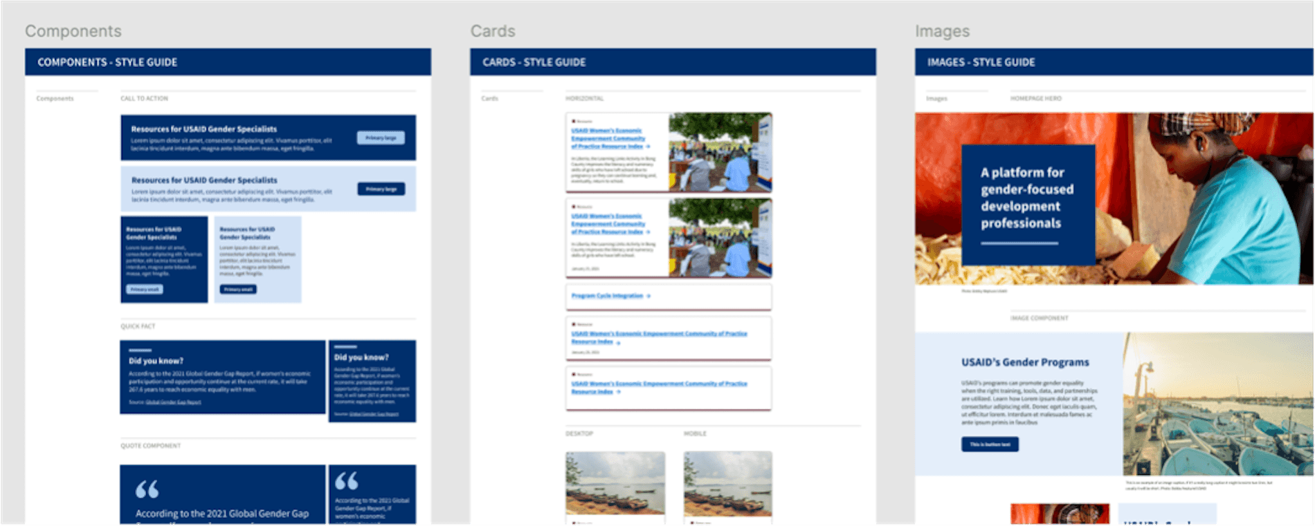
To establish the design system, I focused on setting expectations with the client and formalizing the components with the UI Designer.
Umm, are we going to clear these accessibility hurdles on time?
USAID requires new site builds to complete a Voluntary Product Accessibility Template (VPAT) to ensure they meet Section 508 and WCAG criteria. This process took a lot longer than I anticipated and ended up causing a fair bit of development re-work. This was a pretty stressful time of the project, but the team really pulled together and we completed the VPAT with time to spare. Looking back, there were things I should have done differently—this experience inspired me to take an accessibility course which helped me understand its importance to good UX, and advocate for it earlier in the process.
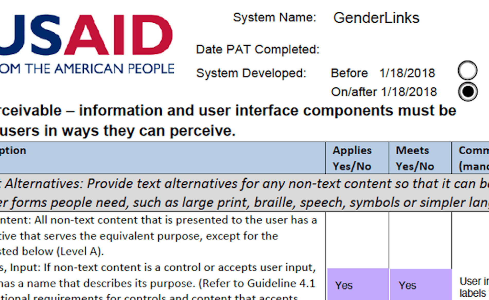
USAID requires new site builds to complete a VPAT to ensure product meets Section 508 and WCAG criteria. Meeting the criteria required design and development re-work.
We delivered on our mandate and set GenDev up for success—despite delays and an eventual pivot.
From the outset of the project, I wanted to make sure we were setting up our client for success (and hopefully Bixal for more contract work). Working with various team members, I drove the development of a site measurement model, creation of a content governance plan, and completion of usability testing.
GenDev ultimately decided to reconsider the vision of the site, and I wasn’t able to see it launched before rolling off the project.
Regardless, I am proud of the work that the team did considering the timeline and budget constraints, solutioning challenges, and content and accessibility hurdles. I gained a deep appreciation for the variety of work that needs to happen to bring a product to life, learned how to collaborate and coordinate more effectively with team members, and learned how to create the right context for good decision-making.

To set up GenDev for success, I created a measurement model with an Analytics Specialist, and the Frontend Developer integrated Google Analytics classes into the site code.
