project story
Improving SSA's Online Transaction Experience
COVID hit right as the project got started, forcing the team to shift to remote interviews.
COVID forced SSA to close their field offices just as the project was starting, meaning we wouldn’t be able to do in-person interviews as planned. The team needed to quickly recruit research participants, so I took the lead on drafting a screener and defining the criteria for our research population.
As we conducted interviews, the team had to navigate scheduling mixups, find the best way to talk to people about difficult life events, and account for the limitations of people’s memories. Through it all I tried to remain focused on our broad research questions.
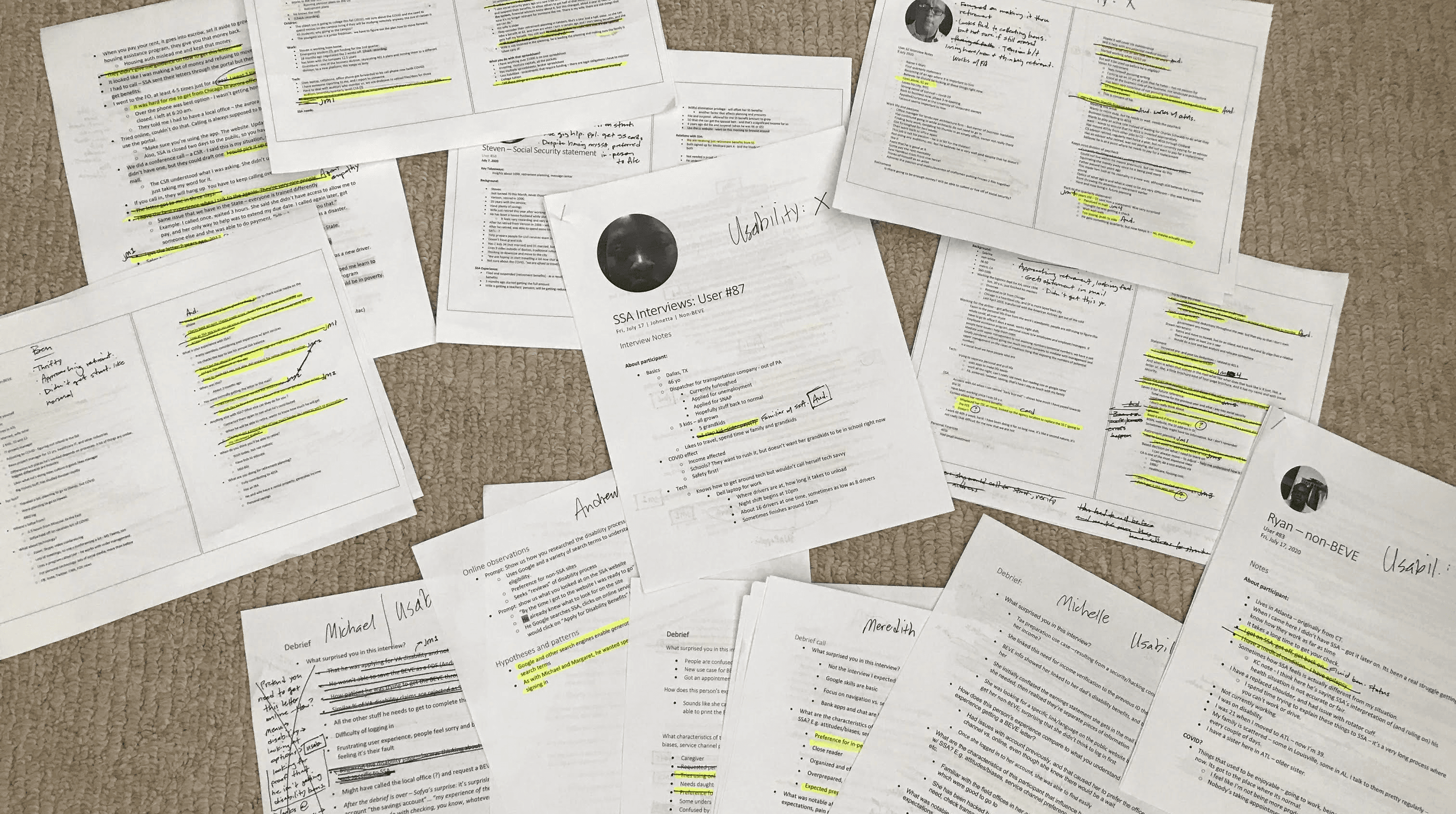
Sampling of transcripts and notes from user interviews showing initial coding.
As we moved through interviews, I helped the research team consider approaches for analysis and synthesis.
None of the four researchers had worked together before, yet we needed to align on how to make sense of all the information we were collecting. I piloted a couple of approaches and facilitated discussions with the team about whether or how we could use them. I also roughed out a framework for an experience map that the team adopted and eventually used to facilitate our analysis and synthesis.
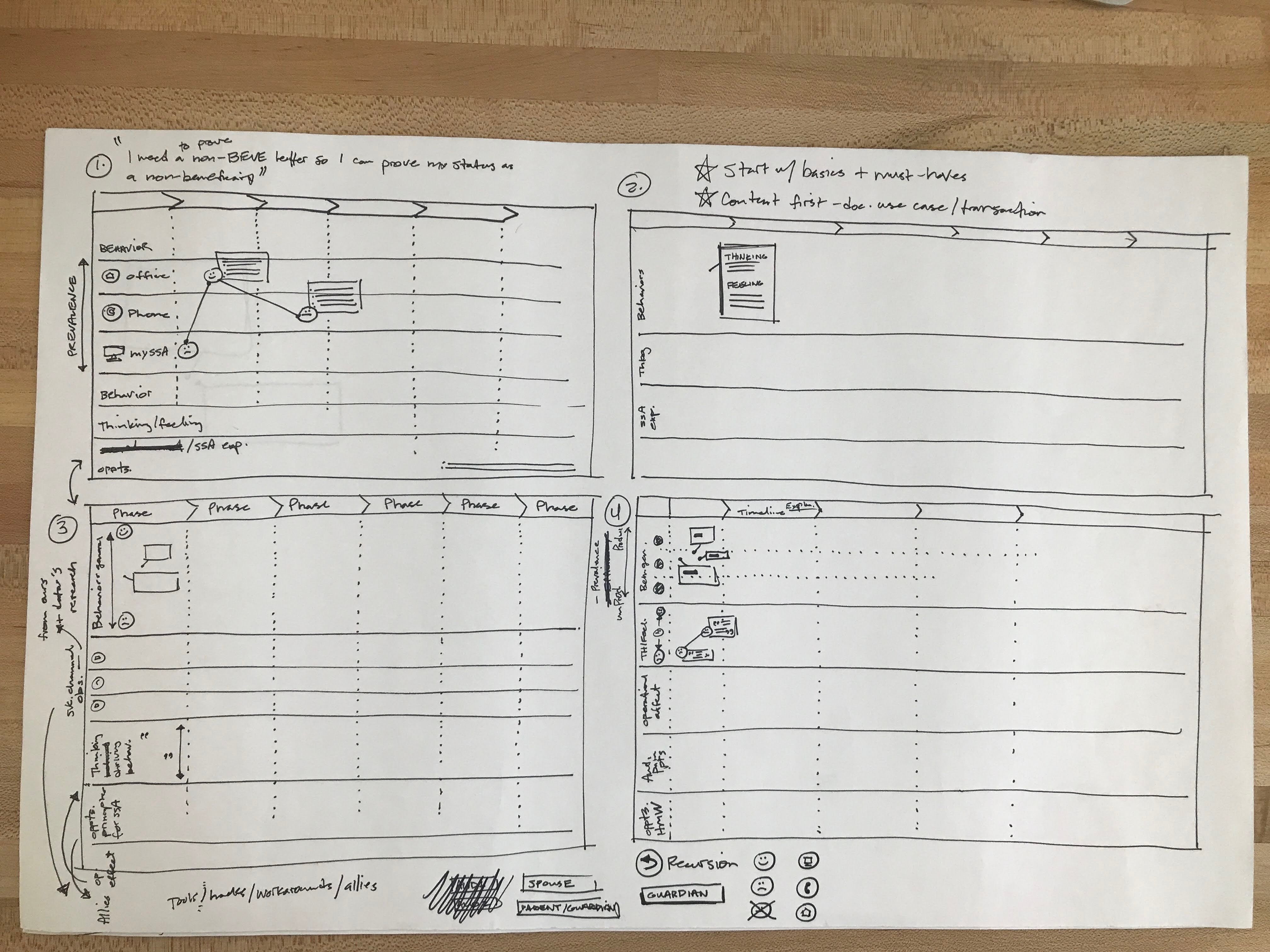
I helped the team of four researchers decide on an approach to journey mapping by creating thumbnails like this.
Documenting the happy path and less-than-happy-path framed the design opportunity.
Early in the project I conducted a heuristic evaluation of interfaces along the transaction path. While this gave us a sense of the issues on a page level, we needed to understand the flow between steps to understand where users were dropping out of the happy path. As the team moved through our user interviews/usability tests, I documented the content and IA problems that interfered with users completing a transaction. I also worked with our product manager to communicate that to SSA through the concept of a service funnel.
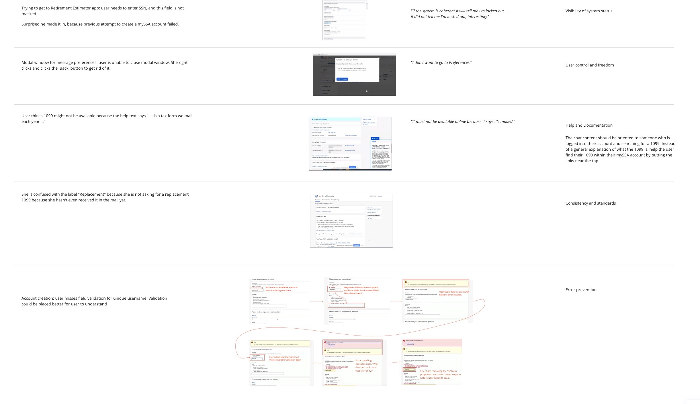
Early in the project I completed a heuristic analysis of the transactional pages and supporting content pages.
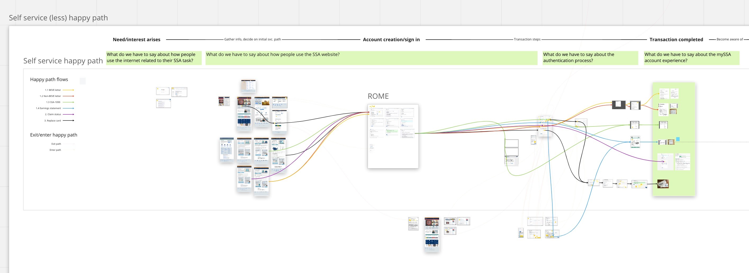
I created a "happy path" baseline, and documented the diversions from this path that emerged from user research and the heuristic evaluation.
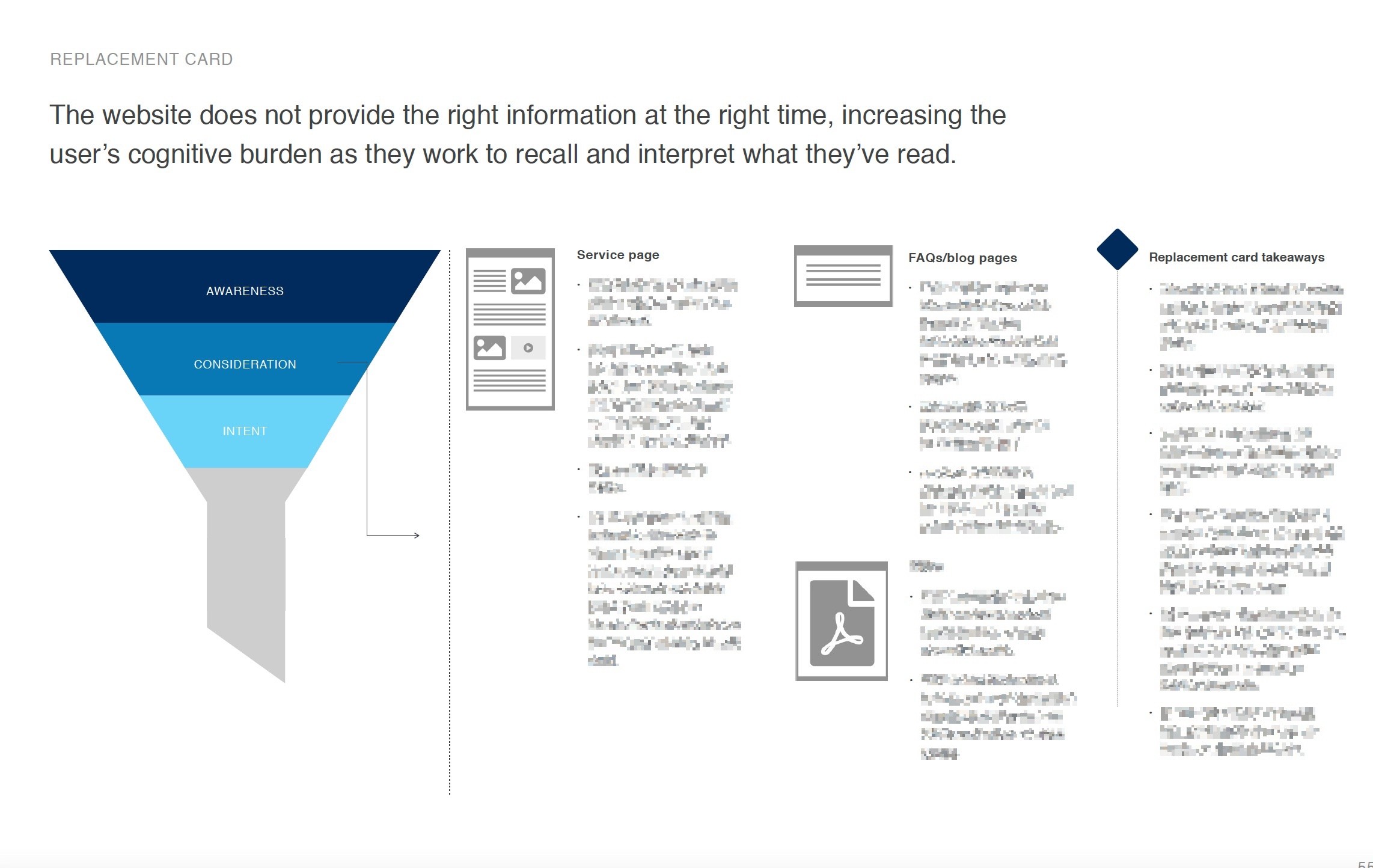
I created visuals to illustrate the information gap in the middle of the transaction service funnel.
Storyboards communicate the ideal future service experience.
As part of the final discovery report we needed to propose an MVP concept for one of the three SSA transactions. The MVP would require not just the development of a new hub for the transaction, but also re-organization of existing content on the SSA.gov website. We decided to use storyboarding to communicate the future service experience to SSA. I developed a story arc to help the team align on the narrative, and then developed storyboards for each of the three transactions. Before going on paternity leave, I worked with the visual design team on a creative approach.
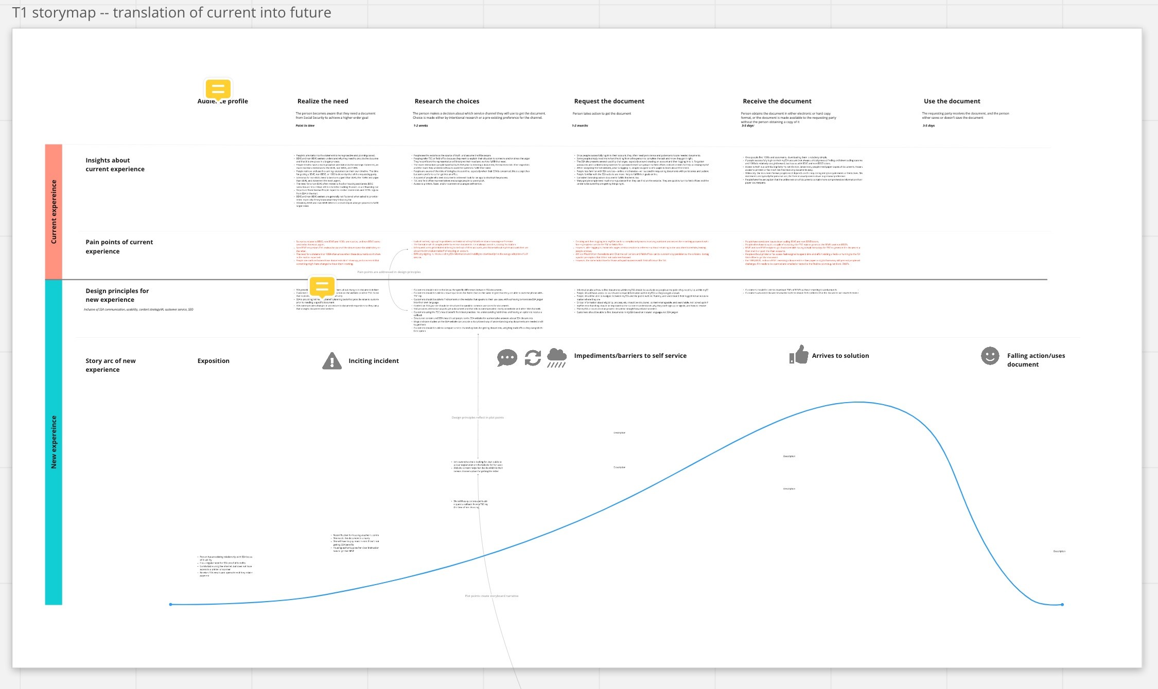
Before writing out storyboards for the MVP, I created a story arc to communicate major plot points of the user's experience to our team.
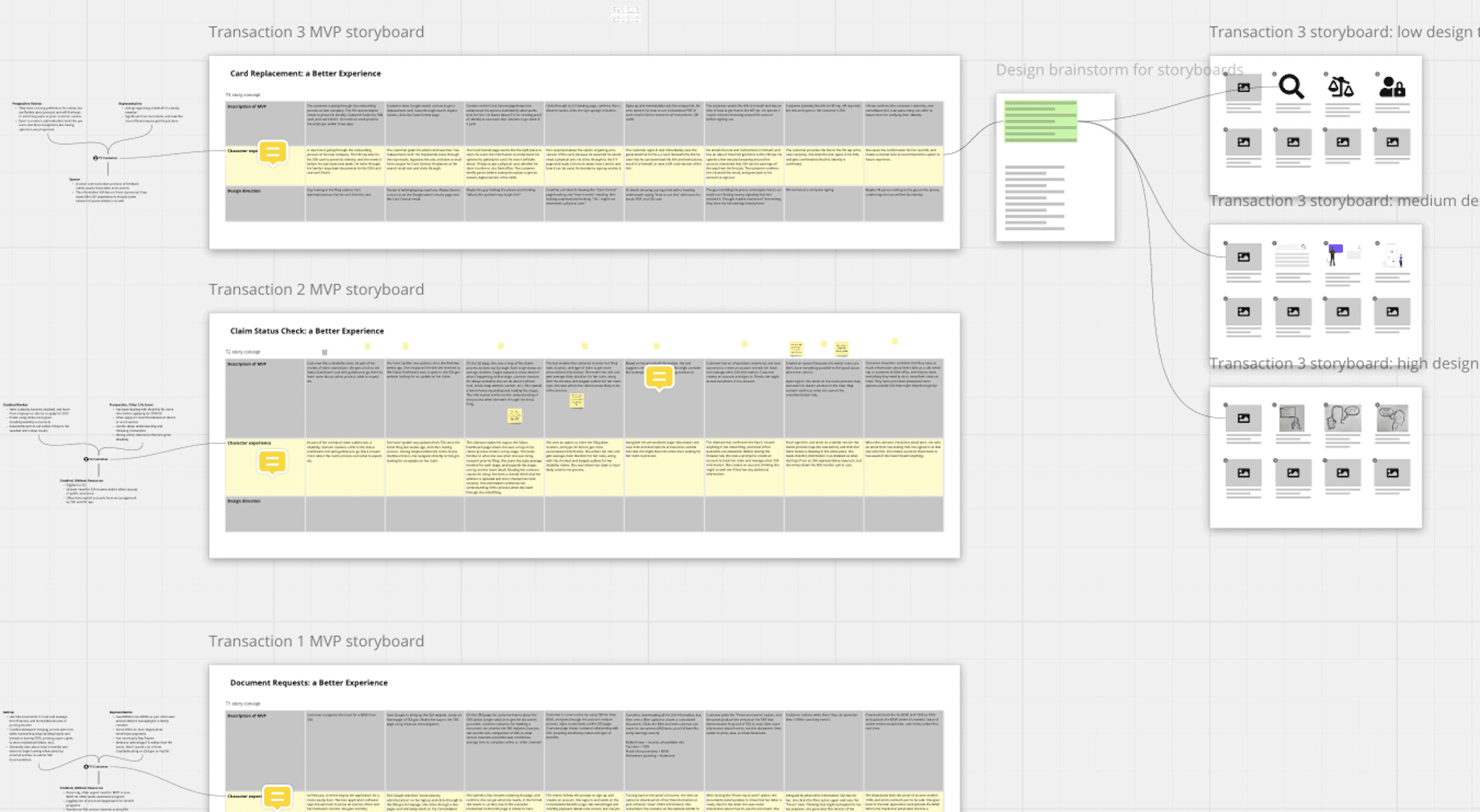
For each of the three transactions I wrote storyboards and strategized illustrations with the visual design team.
I guided the team through a content-first approach to the MVP prototype.
I conducted a content analysis that helped the team define the initial boundaries of our MVP and confirm our understanding of handoff points to other related SSA services.
The client wanted to demo a content-accurate prototype internally so they could get buy-in from other stakeholders. I developed content priority guides for each screen of the MVP, channeling the input of my two other UX/UI teammates.
Working a sprint ahead of our UI designer, I developed the guides, wrote copy (or proto-copy) and facilitated team feedback sessions. This method gave us more confidence about the wireframes that we were building and testing.
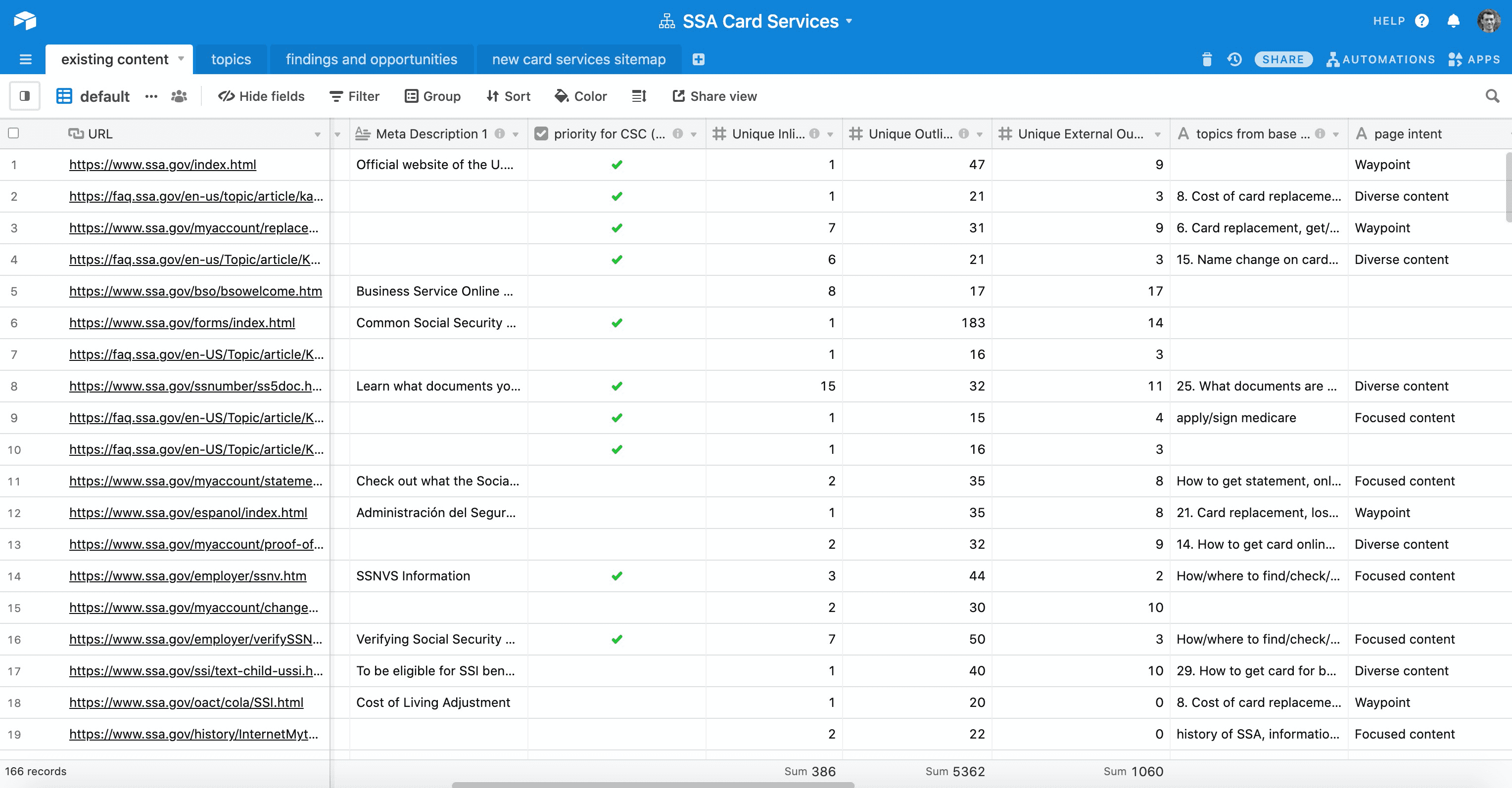
I did a content inventory of SSA card-related content on the website in preparation for a SSA.gov content reorganization.
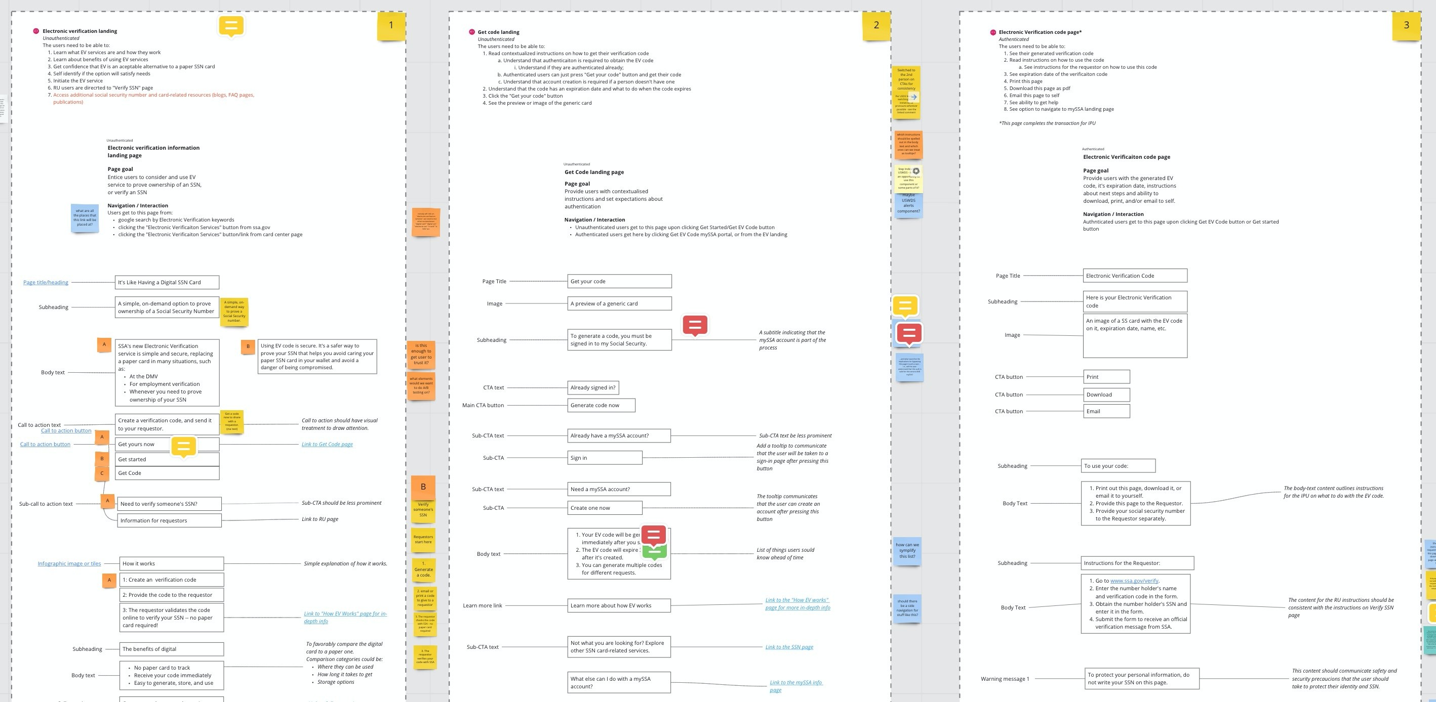
I developed a priority guide framework and used it to facilitate content decisions.
Despite an abrupt end to the project, we communicated the challenges effectively and demonstrated the potential of our design solution.
SSA was pleased with the work the team delivered, and Bixal won another option year to implement the MVP. But SSA decided to pull the plug on the project for internal reasons just as we were testing the prototype. Although we were not able to launch the MVP, we had demonstrated key issues with three of SSA’s main transactions, presented a strong case for our design solution, and developed a content-accurate prototype. I was proud of the work we did, and hope that SSA ends up implementing some of our design ideas.
