project story
Migration and Design Overhaul for Established Learning Hub
The opportunity was to organize the site's rich information in a more intuitive, structured way.
Learning Lab had evolved to become USAID's authoritative public platform for Policy, Planning and Learning resources for technical staff. But the information was dense and USAID staff and partners quickly would get lost looking for what they needed. We had an opportunity to make the information more findable and shareable, and ultimately contribute to better development outcomes.
To keep the work moving, I routinely translated discovery recommendations into specific design actions.
I participated in a previous discovery where we learned about users' challenges with the existing site, and made recommendations for addressing those issues.
To get the client’s buy-in for specific design changes—especially for early, important decisions about information architecture—I routinely facilitated discussions and created artifacts and to communicate our design intent in a straightforward way.
When tough questions arose, I would go back to the discovery analysis and triangulate among our data sources to suggest an evidence-based answer.
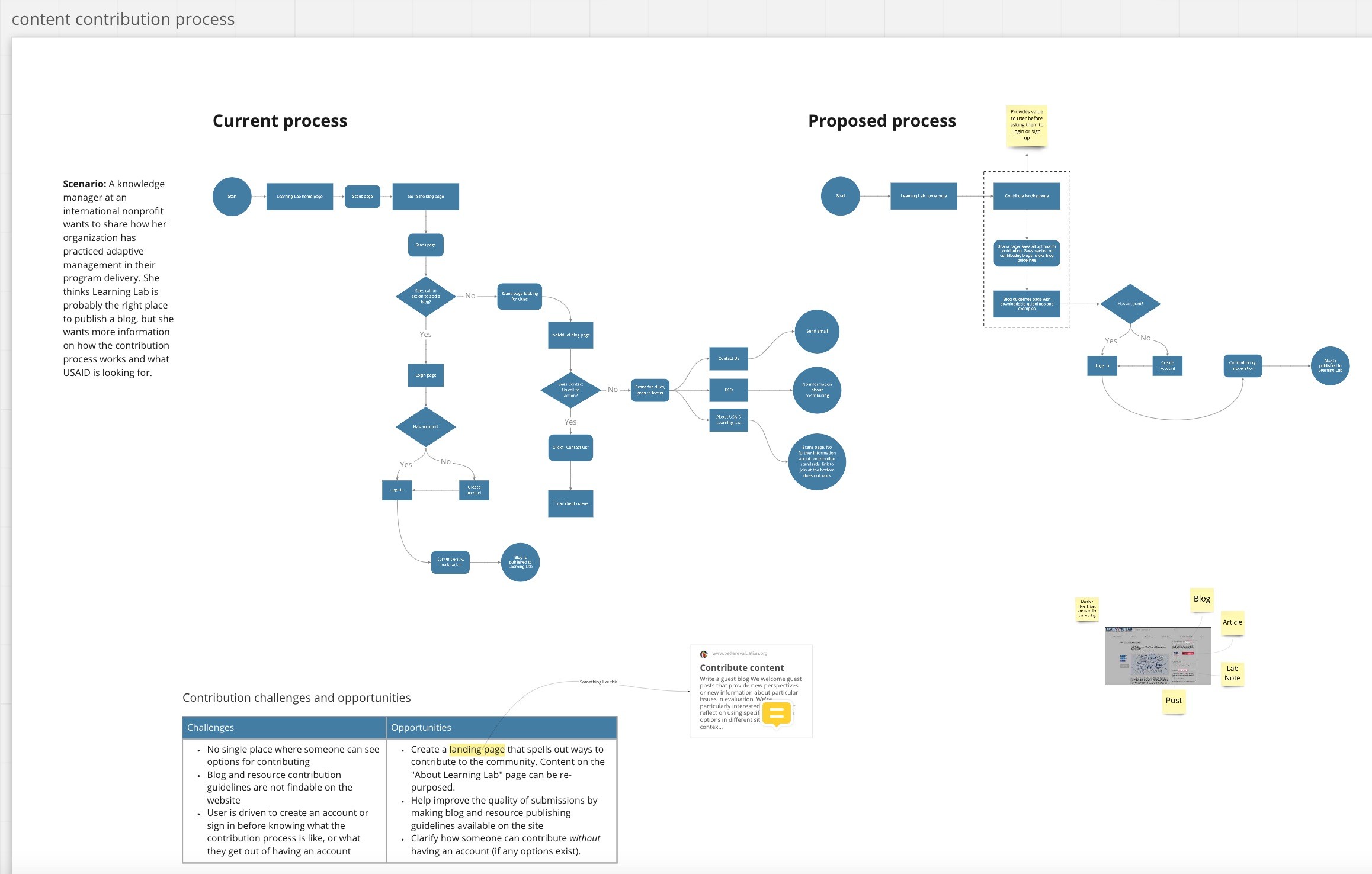
I documented the current user flow for content contributions, and worked with the product manager and content strategist to pinpoint problem areas and define a better process.
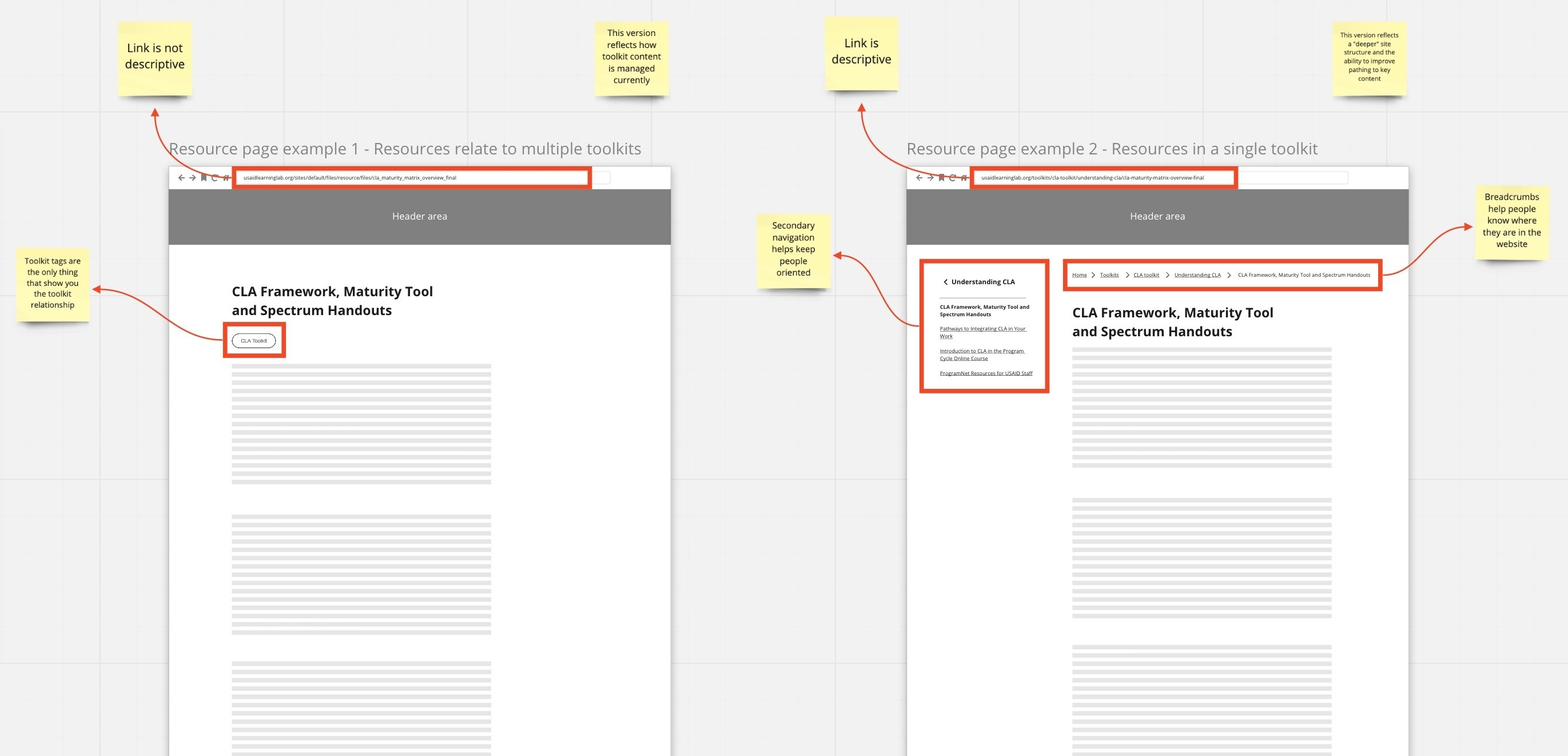
I created thumbnails like this to facilitate early, important decisions about requirements and highlight issues (IA challenges in this example) that the team would need to resolve.
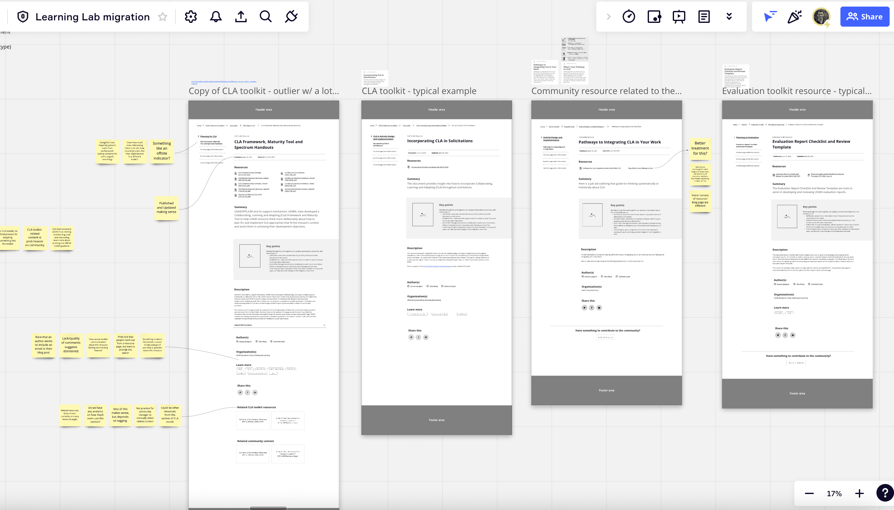
I facilitated weekly sessions with the client as we established a design direction through low-fidelity wireframes.
The most important improvement we made was deepening the site architecture.
During discovery, the team learned that users regularly got lost navigating Learning Lab’s rich content.
One person we interviewed said:
“You follow link after link and the only way to remember the path is to save the link.”
By crawling the existing site and analyzing its site map, I identified that the site architecture was shallow and likely contributing to the user challenges.
During the course of the migration, the content strategist and I suggested a new structure and conducted tree testing to validate those choices. We brought in the client to the conversations as much as possible to ensure their buy-in.
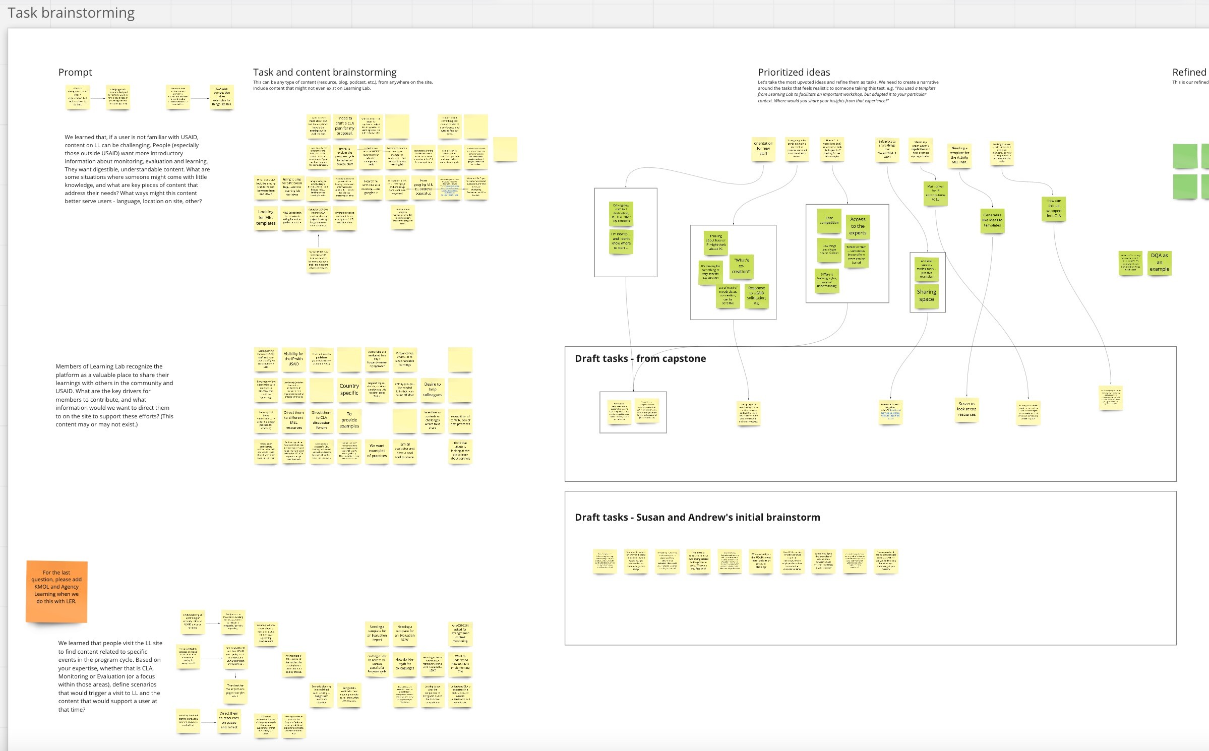
I facilitated a session to identify the main user tasks that we needed to validate in our tree test.
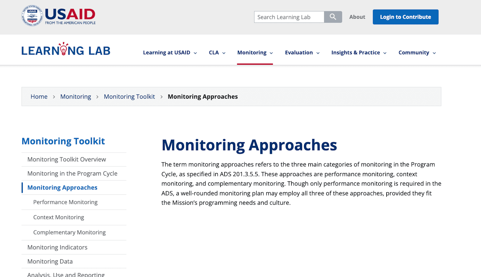
By deepening the site architecture we made it easier for people to navigate and find what they need.
The content structure and site design needed to be backwards compatible, yet forward looking.
Deepening the site architecture would require significant restructuring of the content model on the backend, which the content strategist led.
I worked closely with her, the UI designer, and the developers to ensure that the site design could accommodate both existing content and content that was being developed or re-factored.
Using components and frameworks from the U.S. Web Design System helped to standardize the design components, and also made the UI designer’s job much easier.
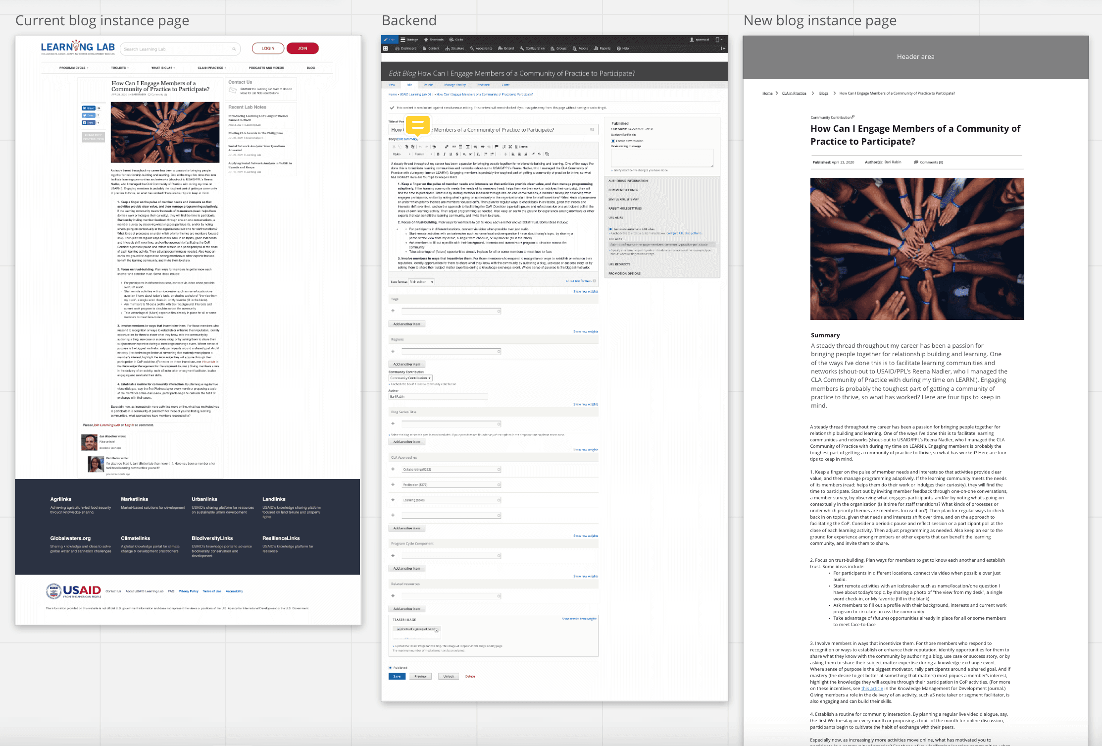
I focused on the existing content structure and how that could be presented in the new design. This involved a lot of mapping of content fields in the existing backend to the existing frontend, and then crosswalking both of those to the new site design.
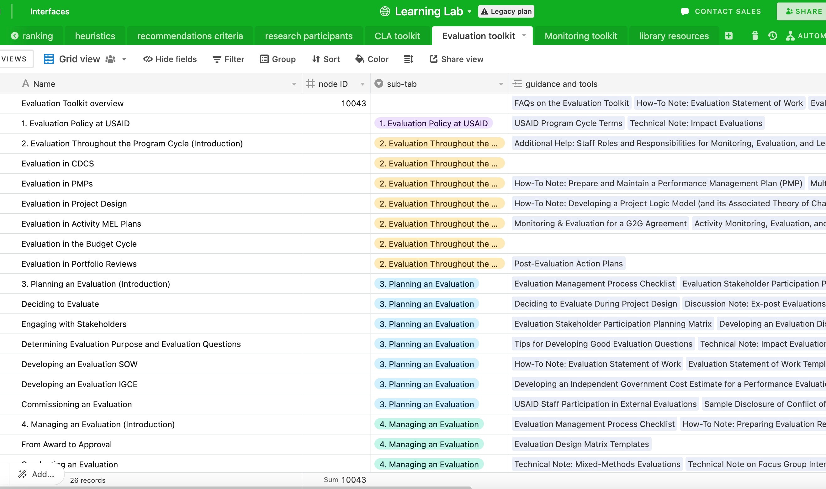
I conducted a content inventory for several key sections of the existing site and created a crosswalk to their destination on the new site.
Teamwork makes the dream work.
My company was sub-contracting to a SME prime who was very invested in the site migration process, and the USAID product owner role changed hands several times.
To help sustain the project momentum, I regularly needed to create context and frame decisions for all our stakeholders.
Throughout the project I strived to include them in the design process so they could apply their institutional knowledge and subject matter expertise to our decision-making.
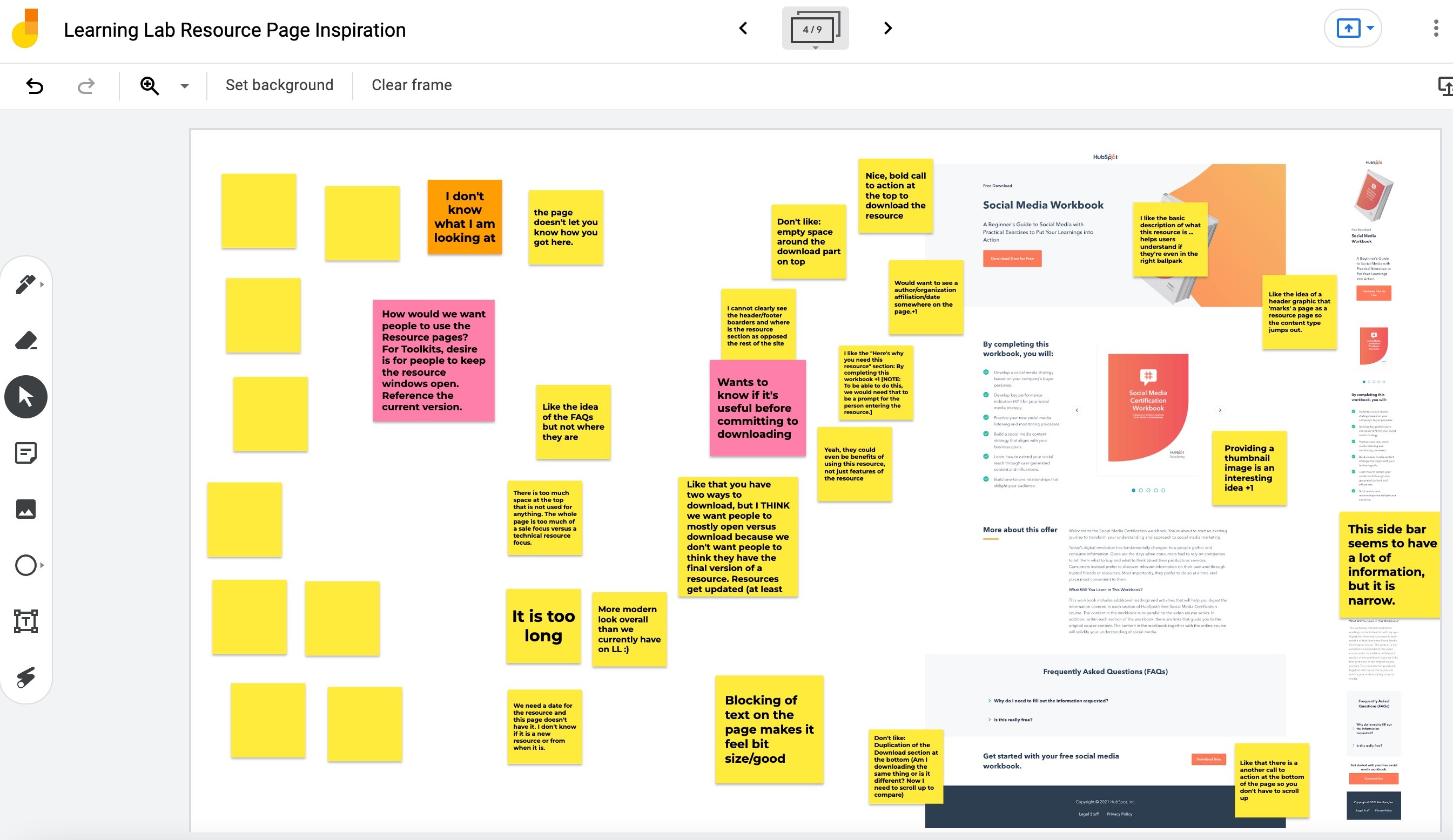
I facilitated workshops to bring the clients in on idea generation and prioritization for key design decisions.
Beyond building user flows, wireframes, and prototypes, I created connective tissue within the team.
The most rewarding part of the project was working with a talented team to bring the site to life. Although we struggled with the design/development handshake, I helped the team bridge the conversations between content strategy, UI design and development—and contributed my understanding of the client’s goals to help us make the best possible design choices.
"Andrew helps connect the dots across design, content strategy, and development. With his previous experience as a content strategist, he brings an appreciation of the importance of content structure and design—both critical elements in delivering a good user experience."
– Content Strategist on the project
The team persisted and finally launched the site.
Despite budget, timeline, and client challenges, the site launched in April 2022 with a simplified content structure, deeper and more intuitive information architecture, and updated visual design.
